Snapcash
A photo-to-reward app. Redesigning a photo-verification reward experience to be simpler and more enjoyable.
Impact
- The photo-based upload UX aligned with the participation patterns of users in their 20s and 30s, increasing initial engagement by approximately 20%.
- The photo verification logic reduced fraudulent and duplicate submissions by a double-digit percentage, significantly strengthening the fairness and trustworthiness of the reward system.
Role
Product Designer
Timeline
May – July 2023 (3 Months)
Team
1 Product Designer · 1 Backend Dev · 1 Product Manager · 1 Frontend Dev
Tools
Figma · Adobe Illustrator · Adobe Photoshop
Contribution
As the product designer, I led the end-to-end UX of a photo-based reward app by:
- Designing the core flow from mission discovery to photo verification and reward redemption.
- Simplifying a complex verify-and-earn process into approachable UI copy and interaction patterns.
- Building a lightweight design system and component library to align iOS, Android, and web experiences and streamline developer handoff.
01
Project Background
Most reward and app-tech services let users earn points through monotonous, repetitive actions like watching ads or step-counting. These offer weak immediate value and dampen motivation, so users quickly lose interest and drop off. As a result, many reward apps run into the twin problems of low engagement and short retention.
01
Low motivation
Ad-watching and repetitive actions leave weak motivation to participate
02
Low retention
Monotonous participation leads to drop-off after short-term use
Low engagement & short retention
02
Desk Research
The reward and app-tech market is growing fast, and at its center are users in their 20s and 30s who are highly accustomed to taking and sharing photos. For them, tying rewards to the already-familiar act of taking a photo, rather than watching ads or repeating tasks, feels more natural and engaging.
03
User Needs / Design Goal
Many reward apps rely on advertisements or repetitive behaviors to accumulate points, which lowers user motivation and fails to sustain long-term engagement. In contrast, people in their 20s and 30s are highly accustomed to taking and sharing photos. Snapcash is designed to provide an intuitive and enjoyable reward experience based on photo verification, making the process more engaging and straightforward.
Pinpoint
Hard to feel immediate value because a large number of points is required before rewards.

Solution
Provide instant rewards even with small point amounts (e.g., low-value gift cards).
Pinpoint
Monotonous participation methods (step counter, ads).

Solution
Offer diverse missions such as location-based tasks, challenges, and shopping verification.
Pinpoint
Too many steps and cluttered screens from verification to earning create high cognitive load.

Solution
Simplify the verify-and-earn flow to the fewest steps and restructure screens to be intuitive.
Pinpoint
Users disengage after short-term use because interactions feel repetitive.

Solution
Enhance immediate rewards to maximize short-term engagement motivation.
Service Goal
Make photo verification effortless and accurate, and boost motivation with instant rewards.
04
IA & Wireframe
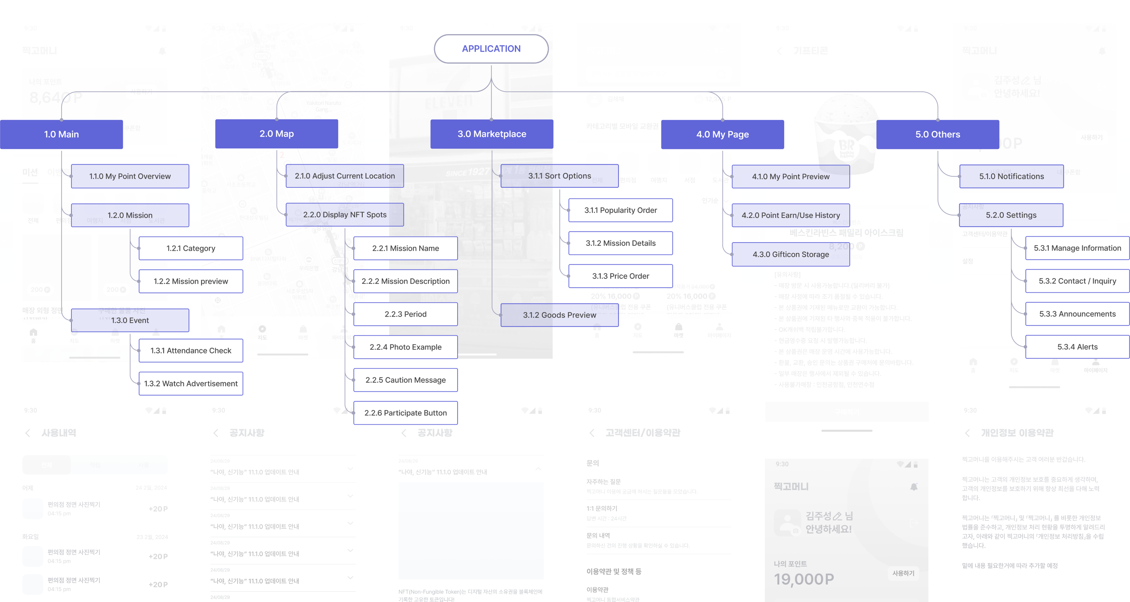
Designed the IA to create an intuitive and efficient flow that guides users seamlessly from photo verification to point accumulation and reward redemption.
05
Why Snapcash?
01
Simplicity
Minimize steps, make earning as easy as a camera click.
02
Familiarity
Use patterns users already know (camera UI, reward systems).
03
Engagement
Add gamification and social feedback loops to keep users active.
06
Design System
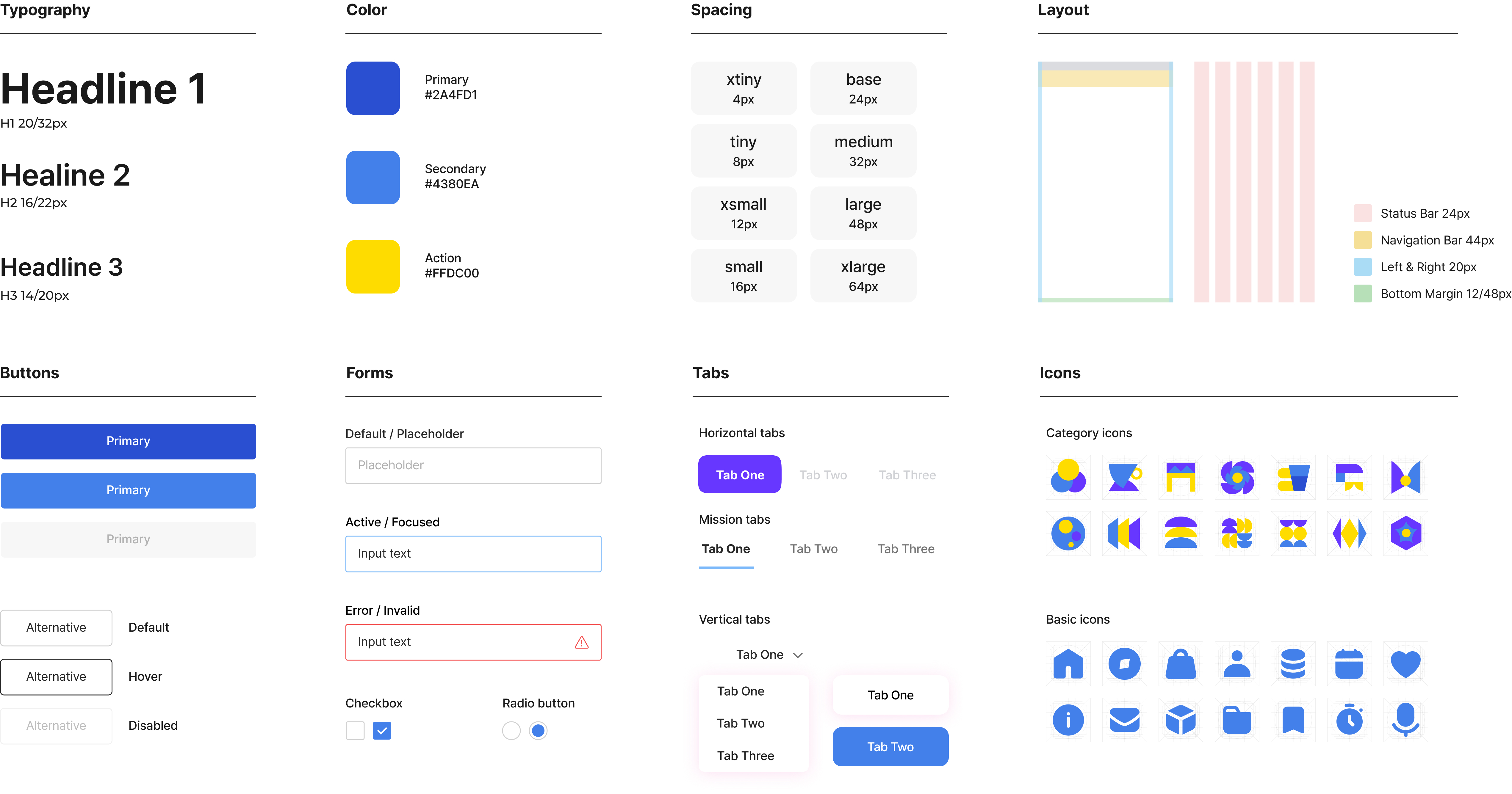
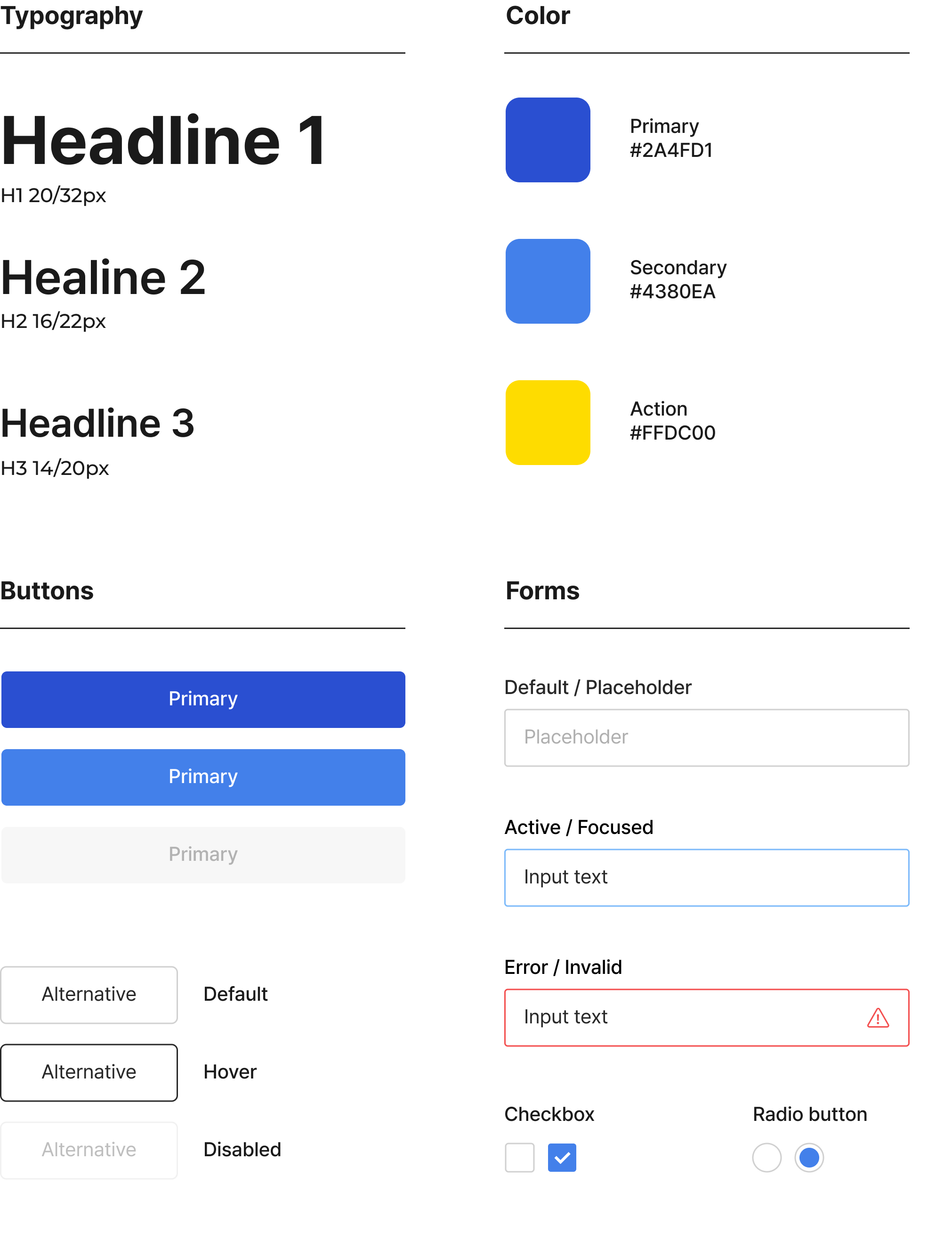
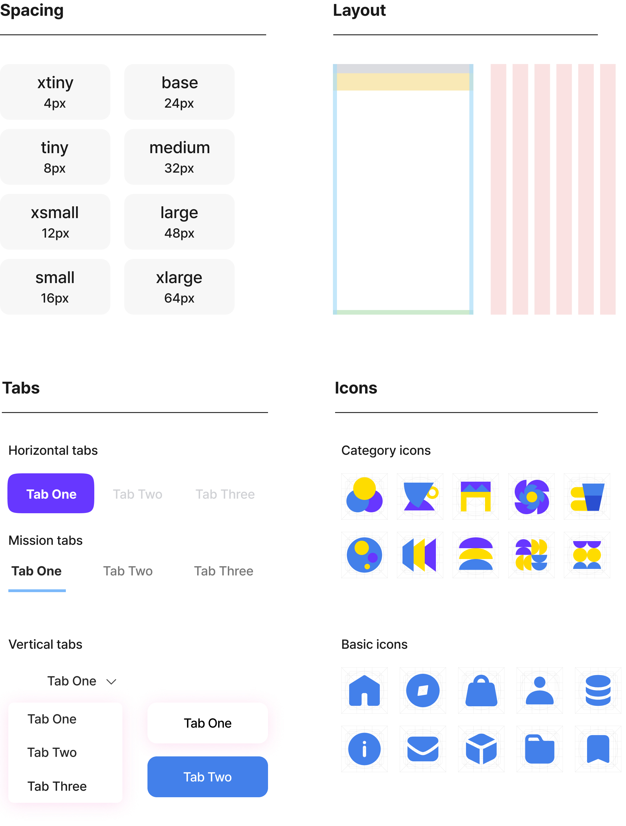
The foundation of the Snapcash Design System ensures consistency across layout, spacing, and radius. These guidelines help maintain a unified look and feel throughout the product.
Color
- Primary#2A4FD1
- Secondary#4380EA
- Action#FFDC00
Typography
- Headline 120 / 32px
- Headline 216 / 22px
- Headline 314 / 20px
Spacing
- xtiny4px
- tiny8px
- xsmall12px
- small16px
- base24px
- medium32px
- large48px
- xlarge64px
Layout
- Status bar24px
- Navigation bar44px
- Left & right20px
- Bottom margin12 / 48px
Component sheet
07
Main UI
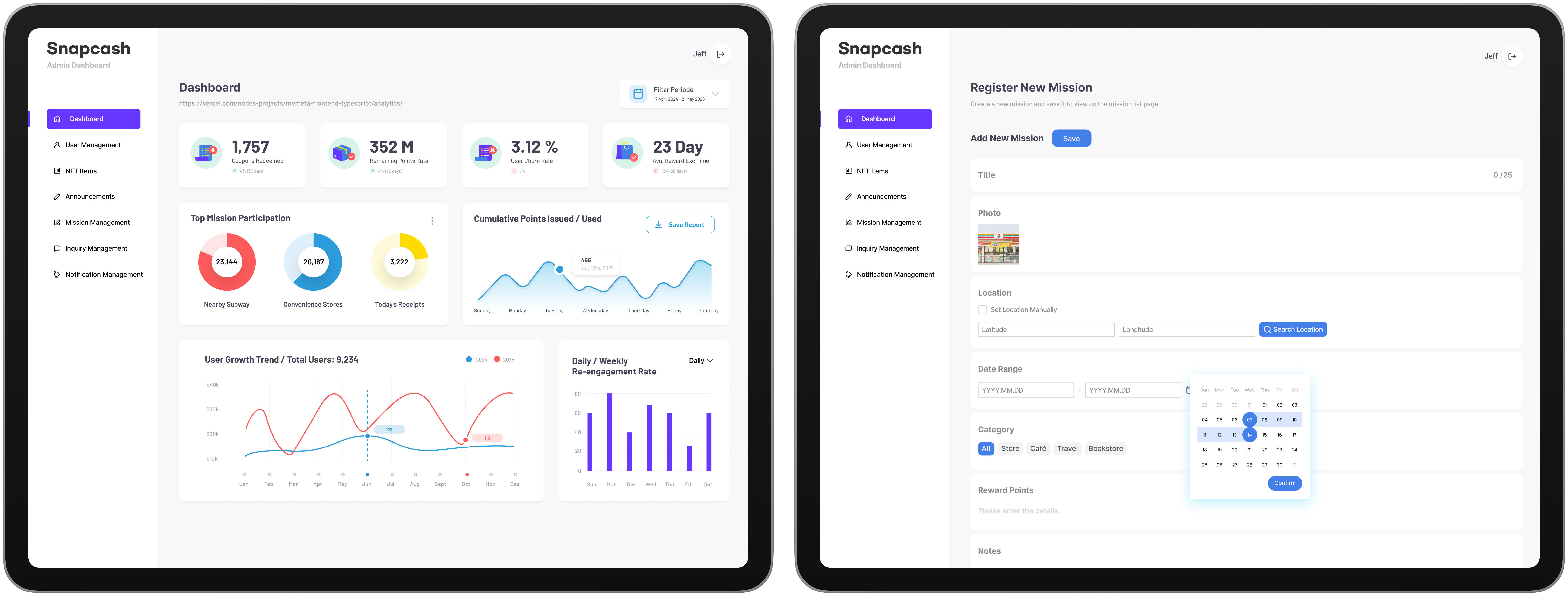
The main UI was designed to allow users to easily view their reward status and available missions at a glance, check detailed conditions, and take immediate action. By incorporating map-based navigation and a camera verification screen, the location and photo-based participation process was simplified. Compared to conventional reward apps, the 3-step flow of Select Mission → Verify → Earn Reward enhances intuitiveness and efficiency.
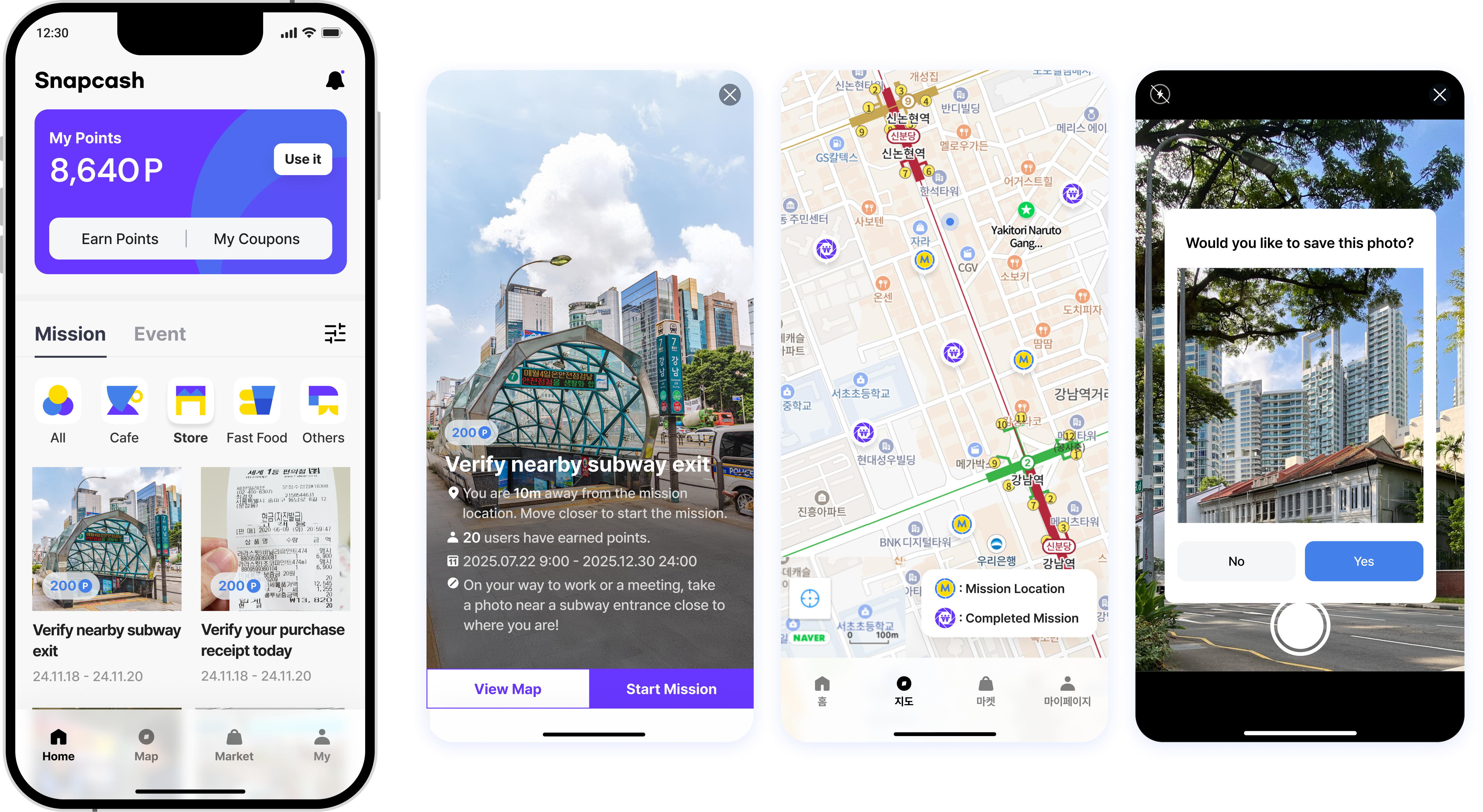
On detail screens, users can see their reward status and participation history at a glance, while complex back-end processing is kept behind the scenes, keeping the experience as simple and approachable as possible.
08
Results
Service journey and beyond
After launching the Snapcash app on iOS and Android stores, we validated the flow from photo verification to point accumulation and reward redemption with users primarily in their 20s and 30s, confirming the product's market fit.
9,000+
Downloads and participation records since launch
Official launch on App Store & Google Play
Growth driven by real users
Steady downloads and participation have continued since launch.
- 01Usability validationVerified the end-to-end core flow, photo verification → points → reward redemption, and achieved high user satisfaction.
- 02Verification reliabilityLocation and image verification logic blocks fraudulent and duplicate submissions, keeping rewards fair.
- 03Market fit confirmedAddressed 20s–30s needs around ‘photo verification + app-tech’, securing an early user base organically.
- 04Engagement driversA variety of missions, from micro-rewards to long-term challenges, sustain ongoing participation.
- 05Category diversificationExpanded brand partnerships to diversify the reward categories.
- 06User base expansionLong-term plan to evolve into an app-tech platform and reach a broader audience.
- 07Business scalabilityA long-term growth strategy through brand partnerships and expanded reward categories.