Market Kurly UX Improvement & New Service Planning
I’d like to preface I have no affiliations with Kurly and this case study was driven by my personal interests.
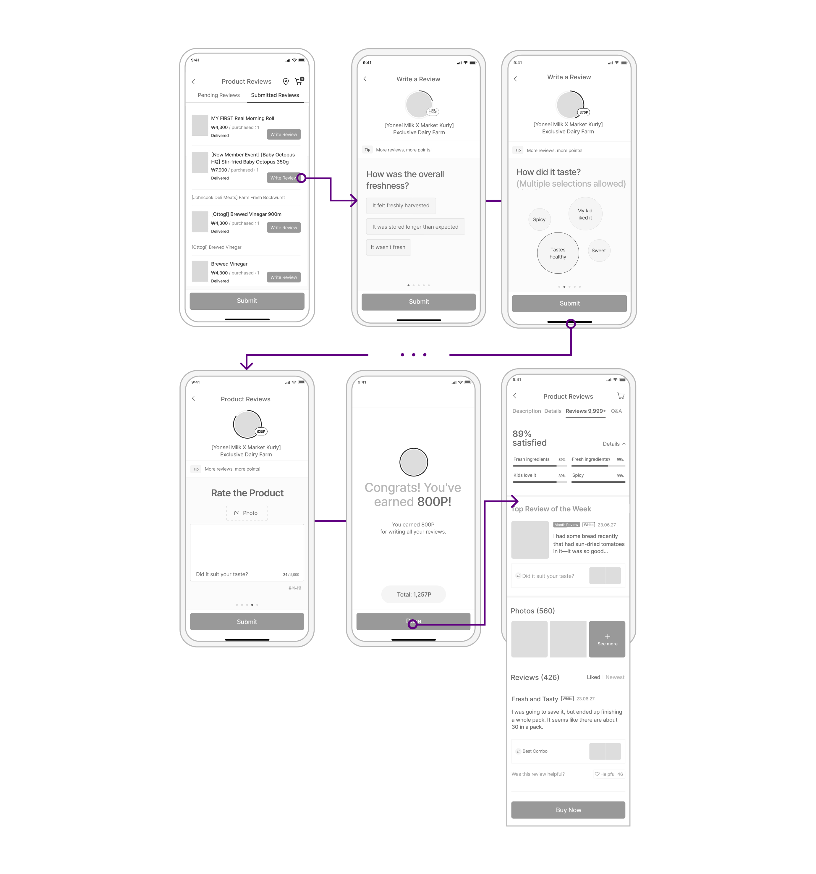
- Implementing a One-Touch Review UI increased the review submission rate by approximately 20%, significantly boosting user participation.
- Enhancing review visibility helped users scan key information more quickly, improving overall browsing efficiency.
- Addressing meal-decision difficulties among users in their 20s and 30s reduced decision-making burden and created a smoother purchase flow.
Role
Product Designer
Timeline
May – July 2023 (3 Months)
Team
1 Product Designer · 2 UI Designers · 2 UX Researchers
Tools
Figma · Protopie · Adobe Illustrator · Adobe Photoshop
Contribution
As the product design lead, I drove the transformation of a B2B fintech/health platform by:
- Redesigning complex B2B workflows into intuitive user paths to reduce friction and make key tasks easier to complete.
- Building a scalable design system that increased interface consistency and improved usability across the platform.
Overview
Despite the title of the first attempt by expanding the early morning delivery, Market Kurly’s own merit is disappearing. I suggest a way to develop Kurly while maintaining Kurly’s brand direction.
Desk Research
To better understand user behavior, I conducted a two-step user research: an online survey followed by in-depth interviews.
Online grocery market still growing
*Source: Statistics Korea, AT Kearney (2025 projected)
Rapid growth in the early-morning delivery market
*Source: Korea Agro-Fisheries & Food Trade Corporation, Korea Investment & Securities (USD estimated)
User Research
To better understand user behavior, I conducted a two-step user research: an online survey followed by in-depth interviews.
1st Survey: Online Questionnaire
Link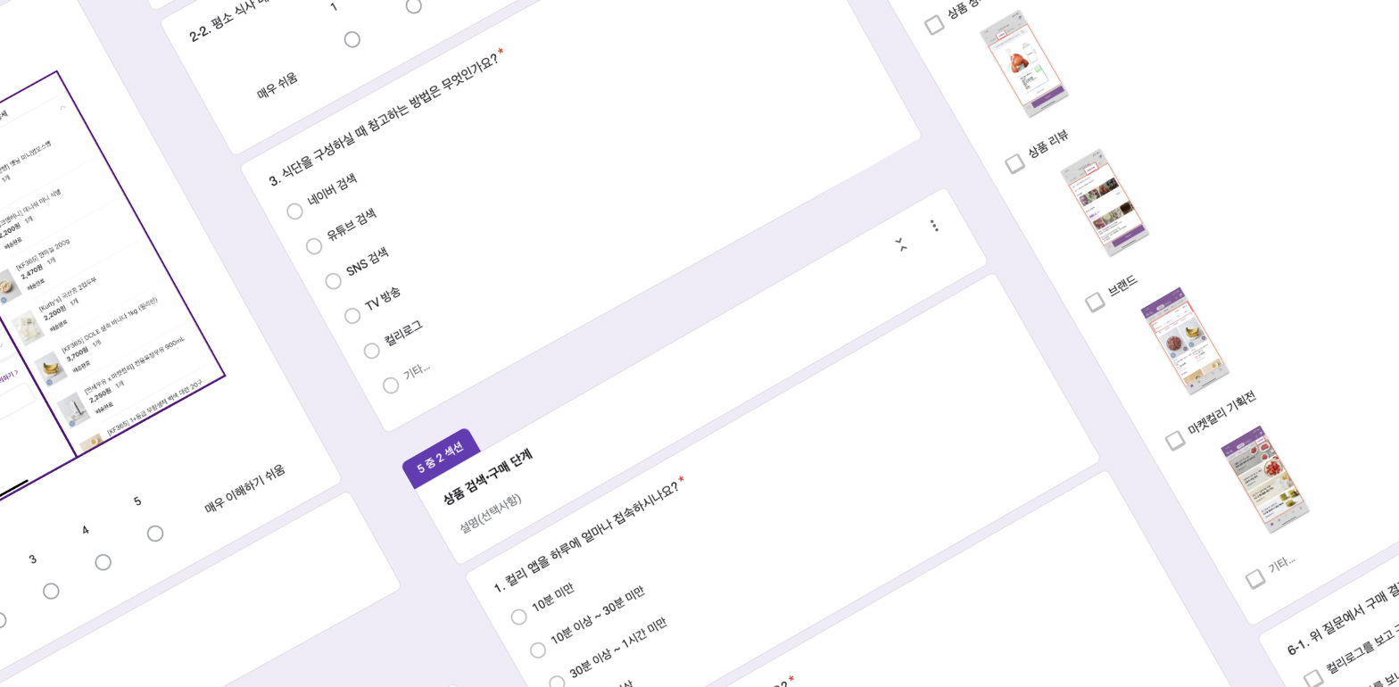
Goal: Understand lifestyle patterns and usage behavior on the Kurly app
Question Types: Preference survey, product search, purchase & review patterns, meal habits
Period: 2023.06.7–11 | 25 questions | 86 respondents
2nd Survey: In-depth Interviews
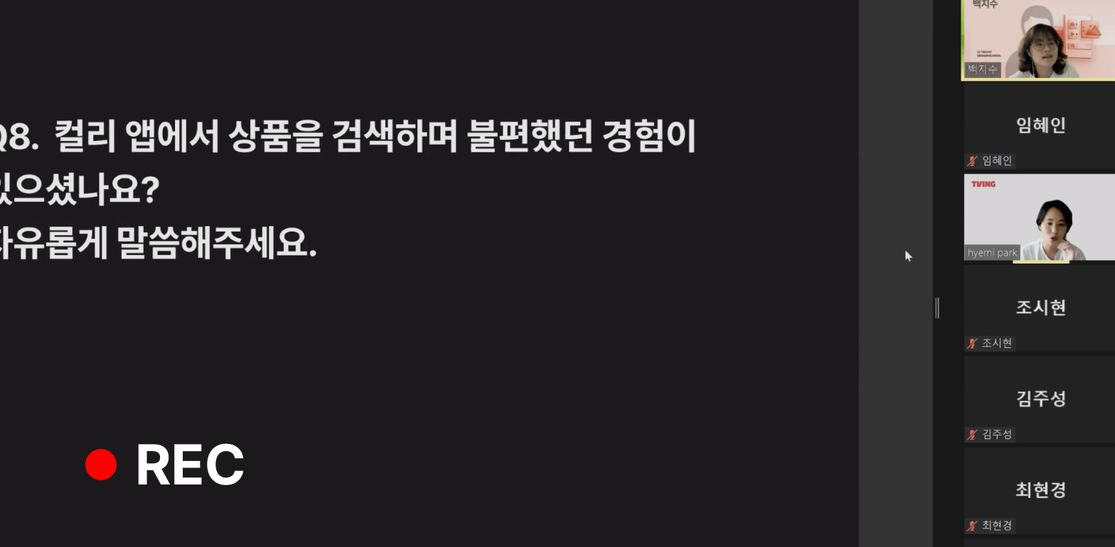
Goal: Extract needs by user segments during app usage
Question Topics: Search, review, recommendation features (combinations, dietary, budget)
Format: 18+ questions, Zoom interviews
Survey Results
Users value reviews, but rarely write them themselves.
Q1. Have you ever written a product review after receiving a purchase?
Q6. What do you consider most important when making a purchase decision?
A large portion of users struggle to decide on their meals.
User Persona
Based on the research, I created user personas to represent key segments and their goals, frustrations, and motivations.
Go Yeon-hee
Party Lover
“I need trustworthy reviews, but I’m too lazy to write one!”
Interest: Interested in discovering new flavor combinations and developing recipes.
Needs: I want quick, personalized reviews at a glance.
Goal: I want reviews to ensure I buy satisfying products.
Behavior:
- Impulsive buyer
- Prefers new flavors
- Buys all at once
Hae-Mi Park
IT Designer
“What should I eat today… Deciding every time is exhausting!”
Interest: I want to have a healthy meal plan and an efficient diet.
Needs: I want a nutritionist-style meal plan to solve the “What should I eat?” problem.
Goal: A meal service tailored to my preferred menus and balanced nutrition.
Behavior:
- Meal planner
- Prefers new flavors
- Split purchase
UX Strategy
Visualizing the core UX strategy: identifying problems, defining goals, and outlining design & functional solutions.
- “Lifestyle Curation”
- Curating culinary experiences that define the user’s [Dining] Style.
- Data-driven recommendation features that build trust.
- Improved usability to increase participation.
- Reduce unnecessary icons and add friendly dining recommendation icons.
- Reviews designed to be easy to scan at a glance.
Information Architecture
Leveraging research-driven insights, this IA builds upon Market Kurly’s existing architecture, reflecting findings from survey results and user persona analysis.
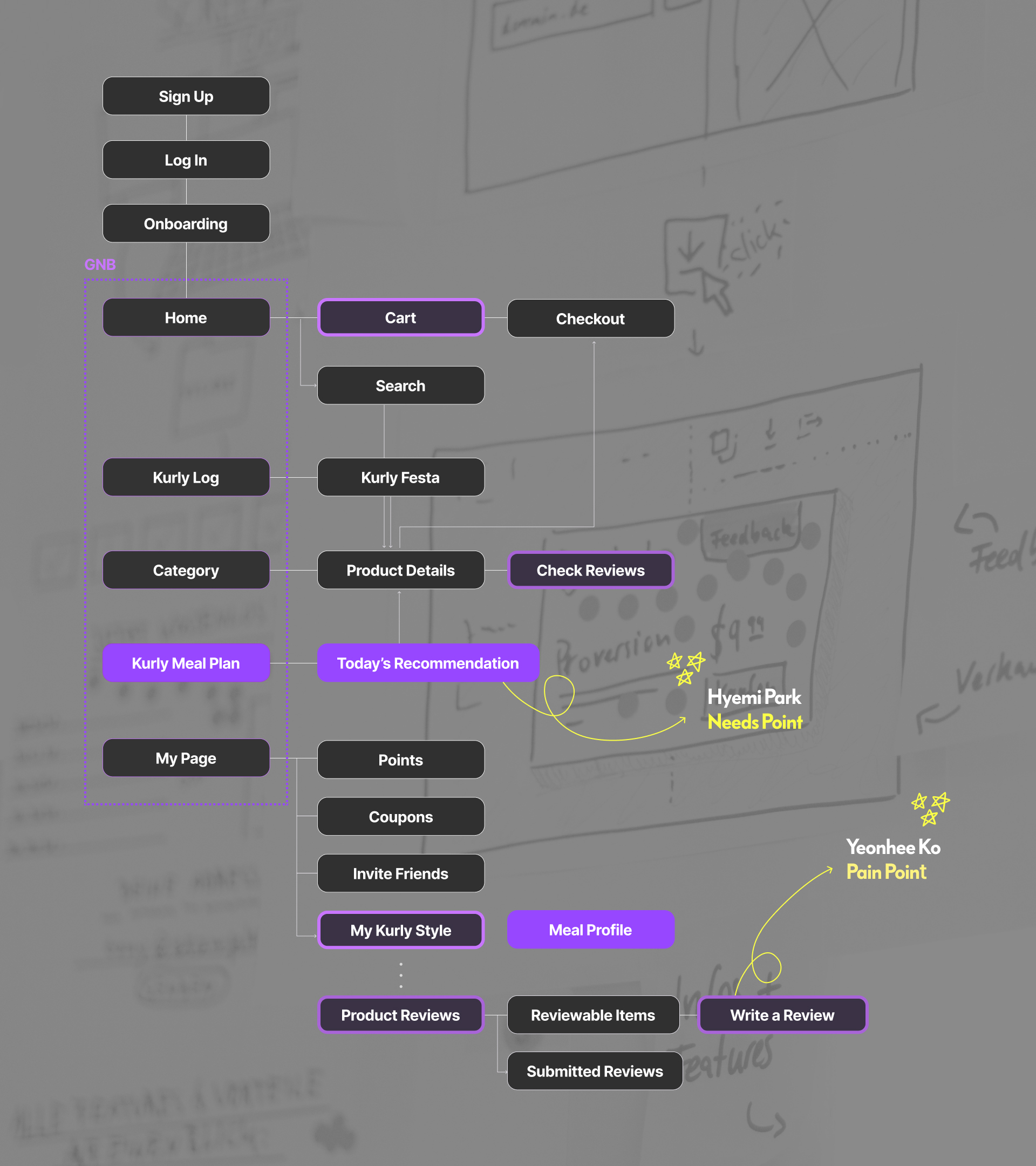
*IA Diagram for Market Kurly UX Renewal
Wire Frames
Low-fidelity screens exploring the flow from review creation to personalized meal curation. Each prototype iterates on navigation, copy, and data entry effort.
Prototype 1
Baseline flow. Simple entry points and default review prompts.
Prototype 2
Reduces taps; clearer labels; quicker allergy & taste inputs.
Prototype 3
Final pass. Clear hierarchy + microcopy aligned to survey insights.
Product Design
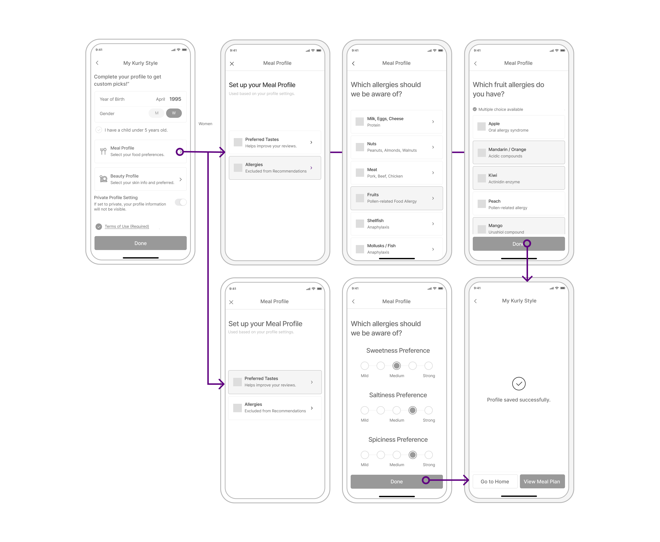
Translating wireframes into a polished, production-ready interface. Focus on clarity, fewer taps, and copy that nudges action while staying friendly.
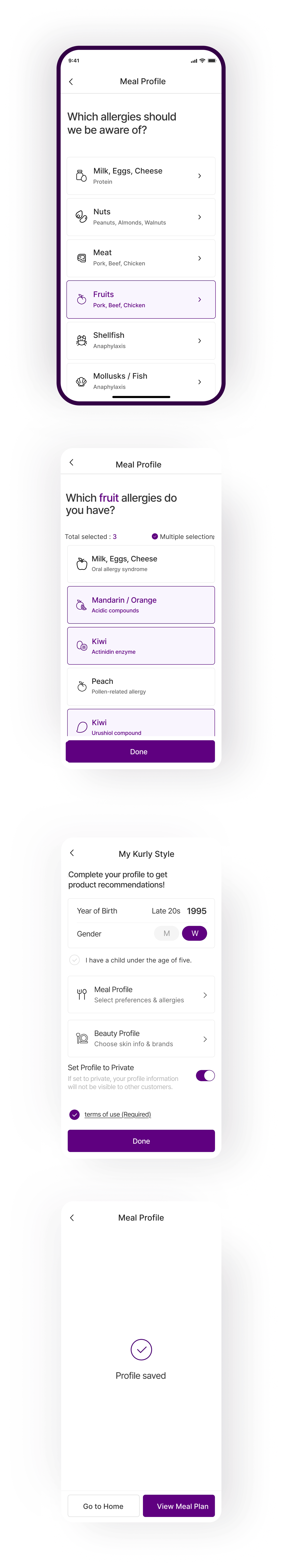
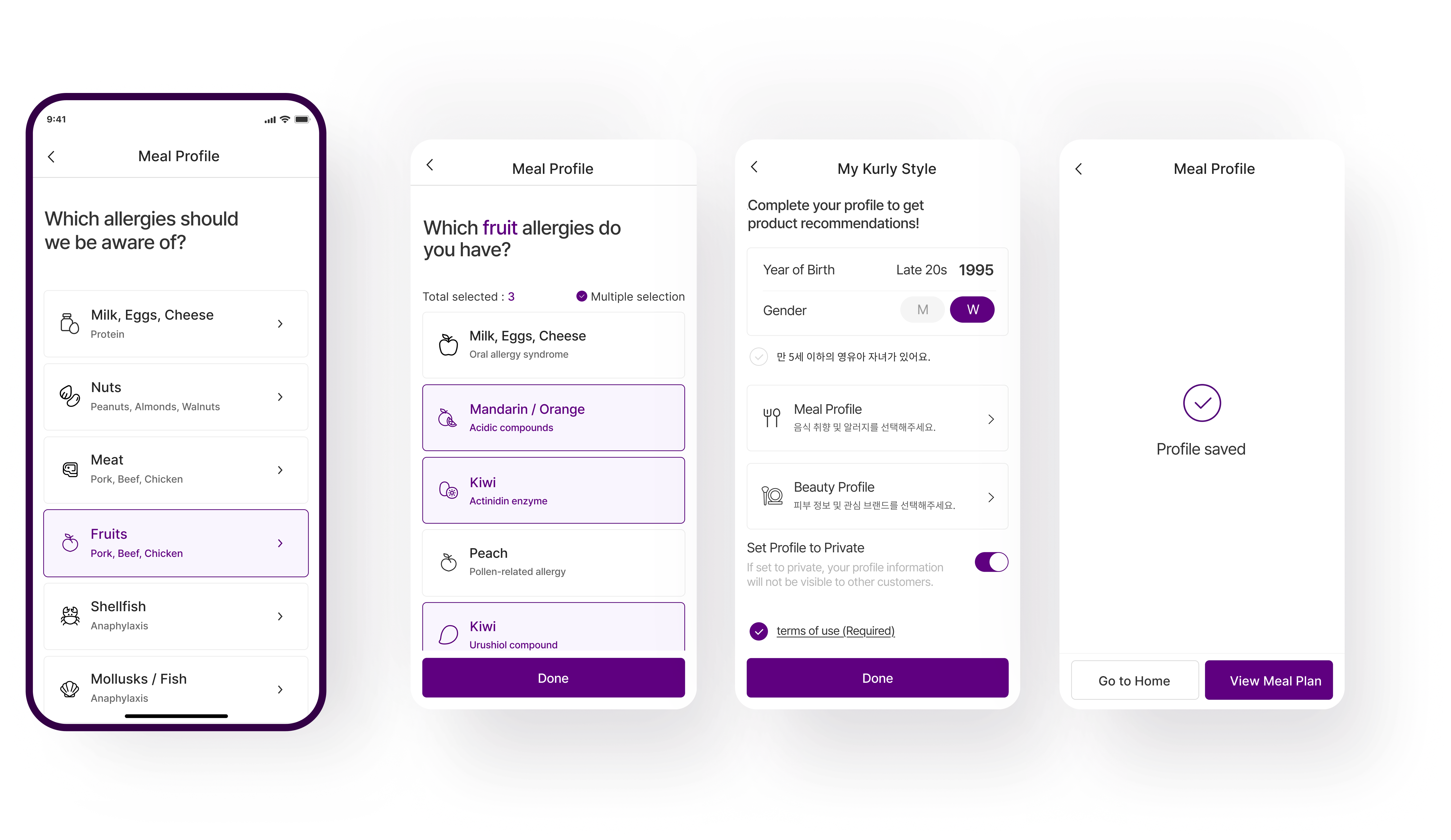
Personalized Meal Profile
We provide information tailored to users.
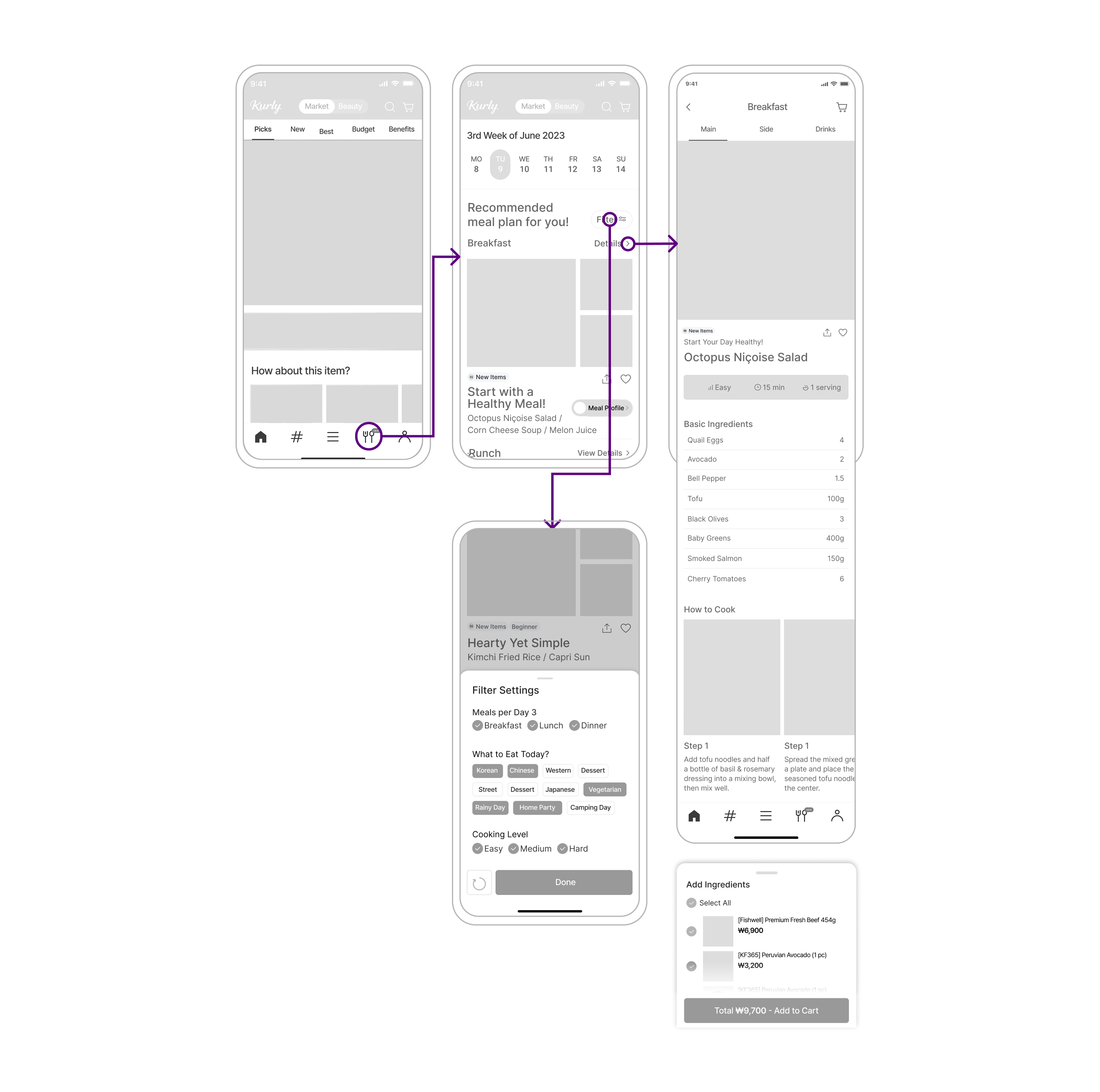
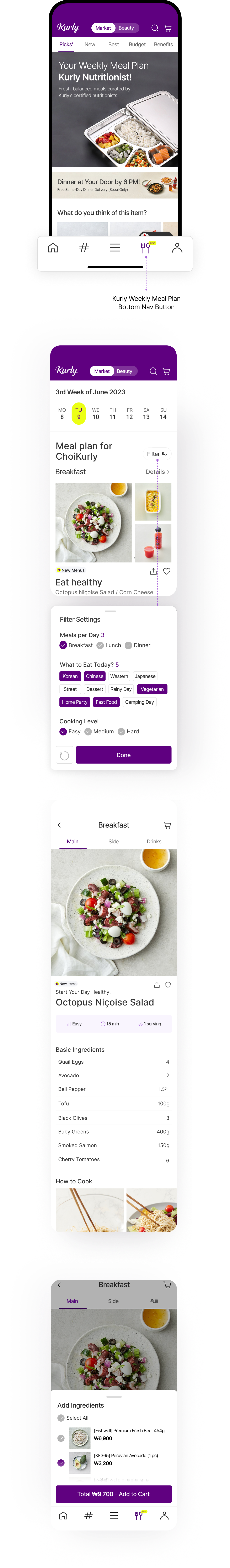
Kurly Meal Plan
Weekly meal categories tailored for you.
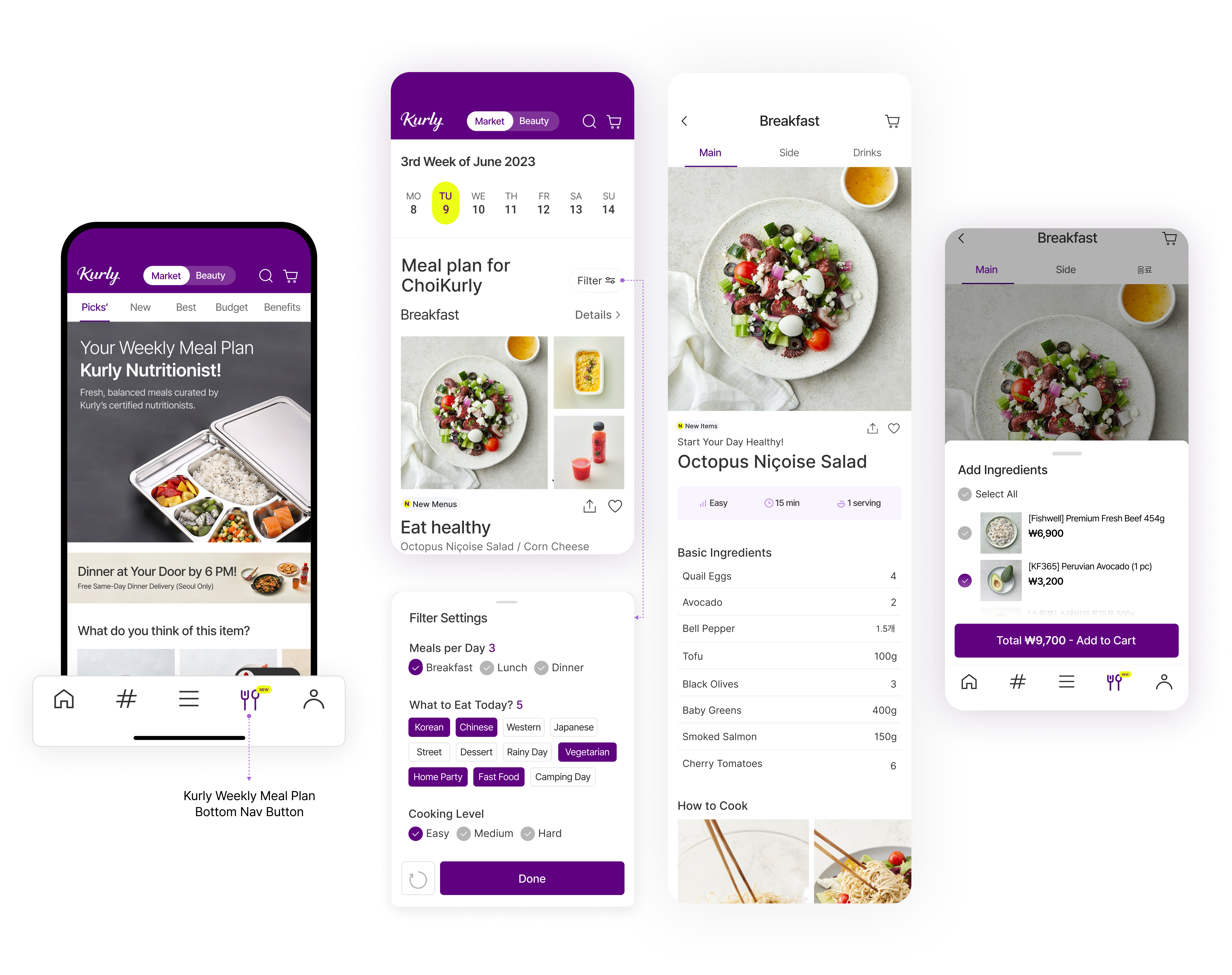
One-Touch Review
Earn more by writing detailed reviews.

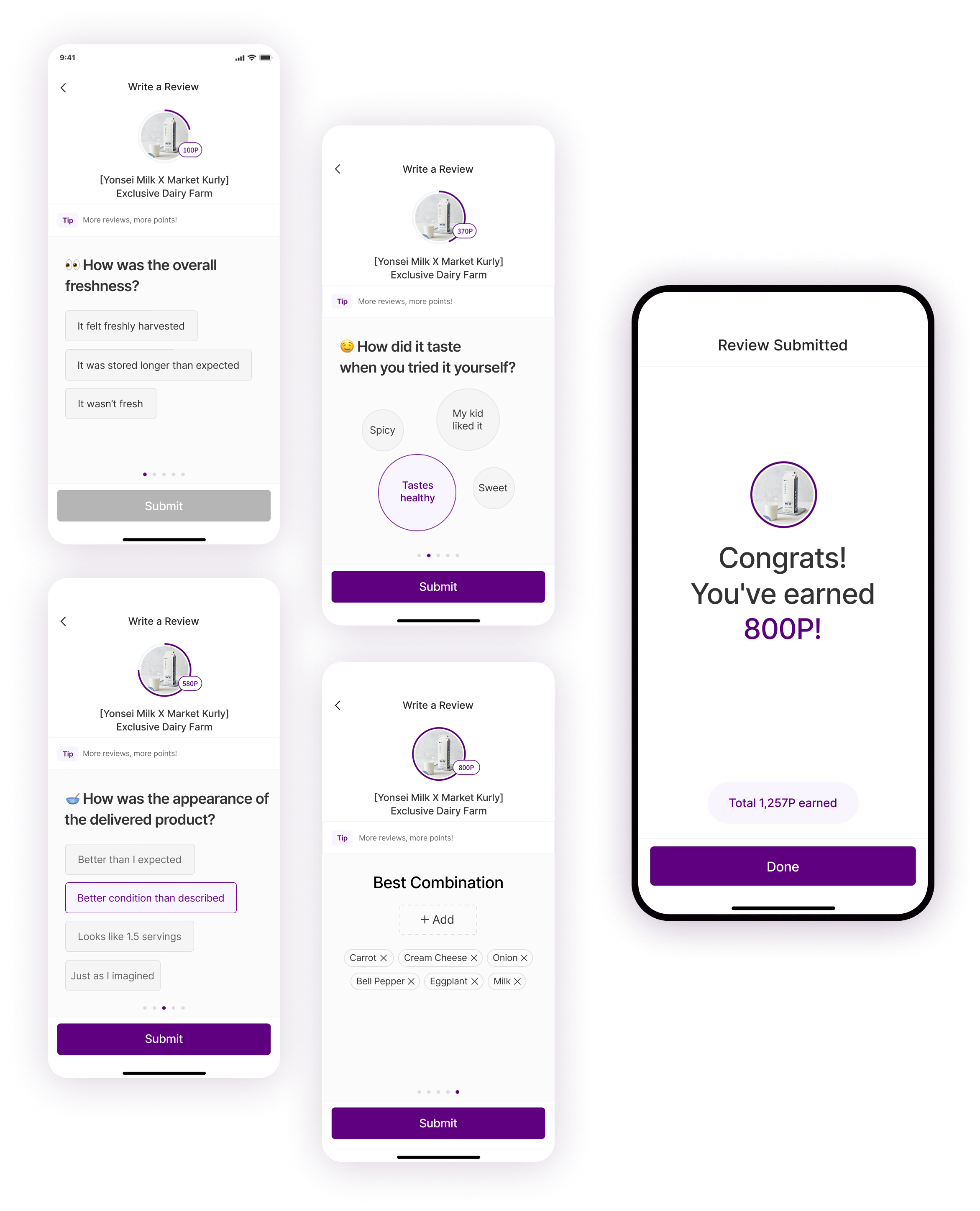
Review visualization

Lesson Learned
- Introducing personalized features such as One-Touch Review and Meal Profile effectively increased user engagement and satisfaction.
- Users appreciated convenience and personalization, highlighting that tailored experiences can motivate active participation.
*All product design screens are based on survey insights and persona goals.